We have two interaction designers who are focussed on user-friendliness in Ubeeo ATS. A few examples:
- You don’t have to be an IT expert to extract data / overviews / reports from the system. In fact, all the data you enter can also be removed and edited according to preference. Together we establish a set of standard reports that we prepare at the end of the implementation.
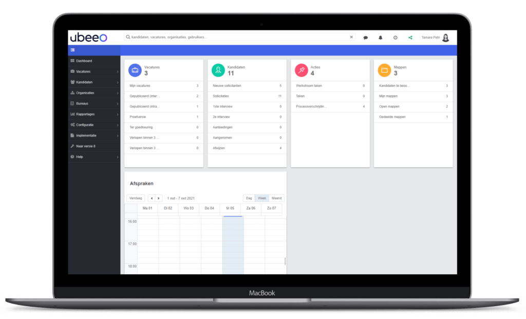
- Each user has their own ‘dashboard’: a home page of sorts, where you can find all the information you need: links to frequently used functionalities, favourite reports, an inbox with notifications on or newly received applications, as well as reminders and alerts for matters that require your attention. We don’t want to bother users with menu items and functionalities that are not used by the organisation. You only see what you need. The same applies for the whole application: You switch off items or functionalities you don’t use.
- Many recruiters like to keep all sorts of lists. It would be a bit pointless to keep doing that after implementing a recruitment system. We therefore included a built-in “spreadsheet functionality”. If you request a list of all candidates for a specific vacancy, or a list of vacancies, you can easily sort different items yourself, rearrange things, remove columns, etc. This allows you to keep track of everything in one place.


